A guest bedroom is important. It speaks volumes about the home owner.Does it welcome your guests? Are you thoughtful ? Considerate? Do you care if your guests are comfortable? Of course you do. So once you have the appropriate elements, bedding, lighting, storage, you are ready to design and style your guest bedroom. The one…
Blog
Color Crush: Lilac
Not everyone’s color crush is a citrus shade tending this season. Some prefer to stay with softer tones. Lilac is a wonderful color that works beautifully in a soft neutral palette. Shown is Sherwin Williams 6835 Euphoric Lilac. Designer Guild’s fabric Cabriole/ Heather blends shades of lilac with cream and metallic accents. Soft lilac walls…
Navy Blue
My latest color crush is navy blue. Pantone calls is Sodalite Blue and Sherwin Williams has #6967 Frank Blue. Navy blue is crisp, smart and classic. It looks great with clear white, silver grey, bright fuchsia and vibrant yellow. I also like it with turquoise. A strong, confident color palette. Love the mix of colors….
Capri: The Color Of The Week
One part blue, one part turquoise, one part teal, a beautiful vibrant color Sherwin Williams Paints calls Capri or #6788. Whether you use a little or a lot Capri brings a vivacious bit of color and brightness. It makes a stunning wall color in a casual or a more formal setting. The tones…
In NYC With Taylor Tomasi Hill
When I saw these photos at Vogue my first thought was, joyous color. The featured NYC apartment is the home of Taylor Tomasi Hill, artistic director for Moda Operandi and all around stylish girl about town. The second element I noticed and love is the styling throughout the apartment. It is balanced, fun, colorful and not over done….
Color Texture Pattern
Color, texture and pattern are important elements of interior design. They are important because they occur in the world around us and are part of our everyday life. Sometimes they are placed by the human hand. Woven chairs placed at round tables in a neat row create a pattern of various colors and textures. A…
Colors Of The Year 2012
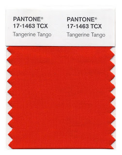
Pantone has named Tangerine Tango has the color of the year for 2012. It is bright, intense, vibrant and vivacious. If you want to be remembered this is your color. A lot A little Vivacious Beautiful Sherwin Williams has designated Argyle as their color of the year. Argyle is a jewel like emerald…
Turquoise
Last week when I posted about Summer Settings there was one color palette that really grabbed me. It was the turquoise with deep brown and accents of fuchsia. Such a beautiful combination. Since I kept thinking about the color turquoise, I’ve put together a group of photos all featuring it. Even though it’s strong, turquoise…
Color Confidence
Today’s post is a pictorial on color, lot’s of it. It’s about color and how much color confidence we each have. There is no right or wrong. We all have a color confidence level. Too little color and we feel off balance, too much and we are overwhelmed. Finding the right amount of color brings…
Blue and White * Bright * Bold * Beautiful
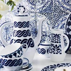
Bright, bold, beautiful are all ways to describe using a blue and white palette. Crisp, clean, confident can also be used to describe this powerful duo. Whether you use it for the entire room or as an accent, bold blue and white will lift your rooms decor. Blue and white, crisp and clean on dinnerware…


