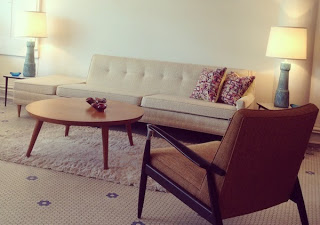
Color, isn’t it amazing? It can change how you feel, how you perceive. It is powerful when used to the extreme and powerful when it is barely used at all. For me, the use of color brings confidence. It should make you feel good. This vignette is color perfect. The light, soft neutrals are a…
Blog
The New Gold and How To Mix Your Metals
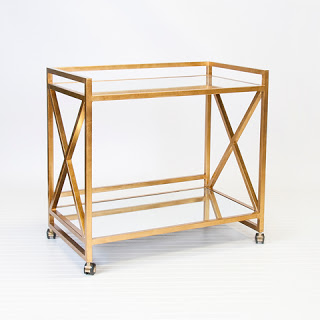
A gold tone as a finish has been out of vogue since the bright and shiny 80’s. Now it is back in a big way. I was a bit reluctant to embrace the return of the gold finish on metals but I’ve come around. The new version of gold is deep and rich and it…
It’s All About The Lights
A new client project has me thinking about and finding beautiful light fixtures for her home. The project includes furniture, fabrics and rugs but for now, it’s all about the lights. The house has a two story entry so this 62″ high chandelier with crystal beads is the perfect fixture to lighten and brighten the…
Cafe Natasha: The Transformation
Cafe Natasha is a Persian restaurant located at 3200 S Grand in St Louis Mo. They have been at their South Grand location for several years. The food is great, the owners are charming but the interiors definitely needed an update. I was called in to help with design. The updated bar Before the updates….
Duncan Phyfe: The Traditional Side Of Mid Century Furniture
When we think of mid century furniture we see sleek, clean, modern pieces. Symmetry, balance, and restraint are elements in the design of modern furniture. Photo from Rocket Century. They are also elements in the traditional furniture that was used in the same time period. The 1940’s and 50’s saw the return in use and…
Shades Of Blue And White Chandeliers
I have recently been to the Gift Show in NYC, various NYC retail stores, and my usual trips around the Internet. During these travels the prominent color I have seen is blue. The shades vary. I have seen cobalt, Mediterranean, faded navy and more. Mykonos blue from Pantone and Danube from Sherwin Williams are good…
Emerald
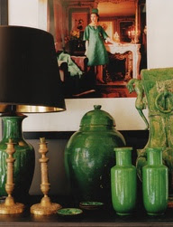
As you may have heard Pantone, the self proclaimed authority on color, has named the color of the year for 2013. It is Emerald, glowing, gorgeous and green. Pantone’s Emerald is a bit on the blue side for me but it is emerald. This post will show you various ways you can use this glorious color…
A Color Palette Of Rich Navy, Silver Grey and Deep Coral
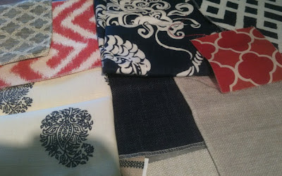
I have been working on a design project for a client who is building a wonderful new home. The kitchen and baths have been designed. Cabinets, counters, tile, flooring, lighting, plumbing fixtures and appliances have all been selected. Now for the fabrics. I have put together a group with a mix of colors and varied…
That Time Of Year
The Ladue News is sponsoring their second annual show house. This year the house is a modern design, by the architect William Bernoudy, built in 1962. I have been selected to design the breakfast room. My color palette includes, grey, aqua, turquoise, cerise, white, orange and honey dew green. The table has a stainless steel…
Plates, Plates, Plates
Arranging and hanging plates on a wall is another way to add color, texture and pattern to a space. Traditionally this was done in a dining room or a breakfast area. Now they can be found in every sort of room and bring a distinct element whatever the design style. What I particularly like about…


