Toile: Updated And Modern
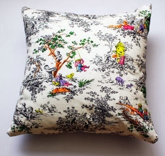
Toile is a favorite of mine. If you know me or read this blog you already know that. Toile is a traditional pattern, but when used in a modern design it brings an unexpected, updated element. Using it in bright non traditional colors add to the modern appeal.
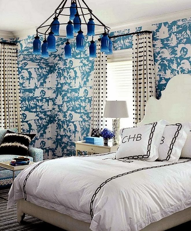
The clean fresh look of this bedroom is enhanced by the blue and white toile wallpaper.
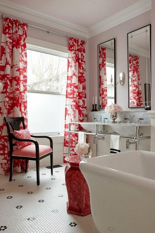
A bathroom that is designed with white, chrome and an accent of black is given a distinct style from the crisp red and white toile fabric.
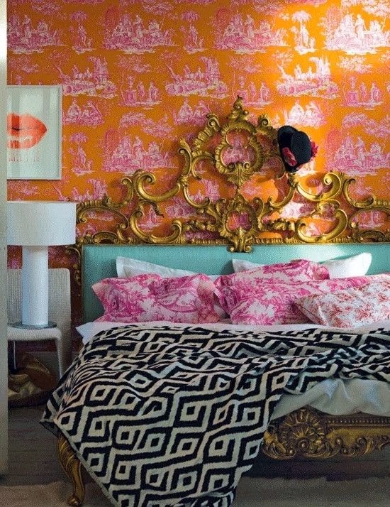
Bright colors, a fabulous gold painted bed and gorgeous toile wallpaper give this bedroom a glamorous look.
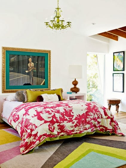
A modern room shows off a wonderful toile fabric.It all works together beautifully.
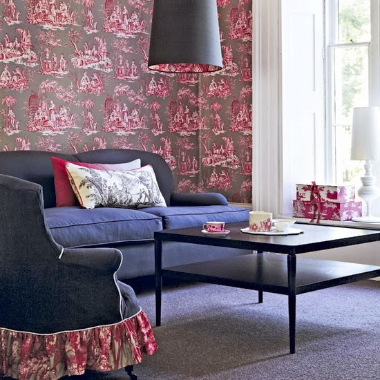
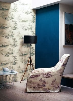
Simple clean lines complement the toile wallpaper. I could do without the gathered skirt on the chair.
Large scale patterns and strong lines give these designs a modern appeal.
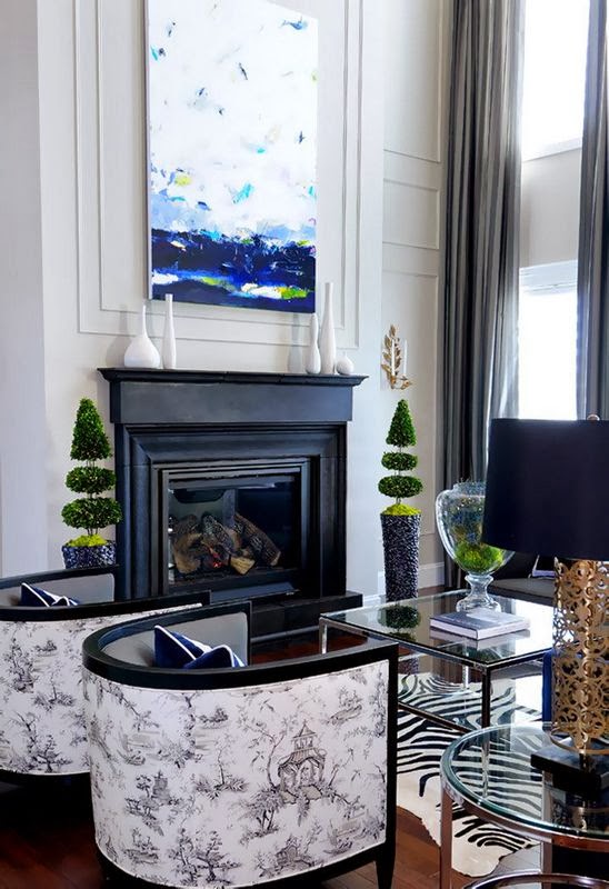
A mix of scale and textures make this room interesting. The toile fabric on the chairs makes it memorable.
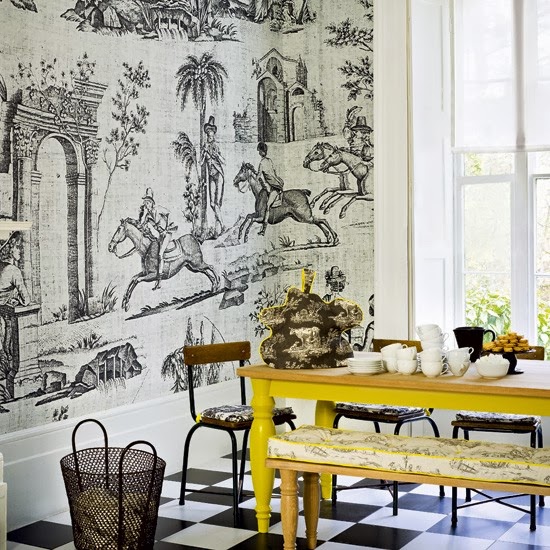
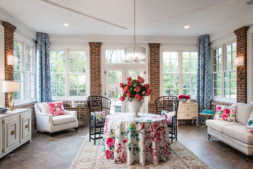
Large scale pattern and bright color creates and updated look from traditional elements in this dining room.
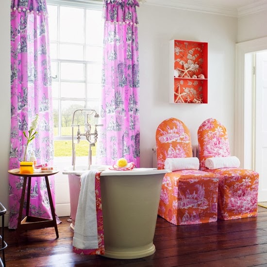
This bathroom is made wonderful and distinct by using toile in strong, bright colors.
In this bedroom clean, white bedding makes the mix toiles look fresh and appealing.
The solid fabric on the chair are a perfect background for the mix of toile covered pillows.
In the past few years I have seen embroidery added to toile patterns. It adds great color and texture. I would like to spend time embroidering on toile patterns.
This is my favorite. The embroidery creates a street wise toile. Love it.
What traditional elements do you like to see in a modern design?

