Combining Colors

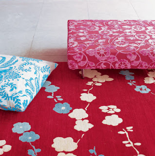
This vibrant color combination is from Designers Guild. The red, pink and blue work wonderfully with lots of white.
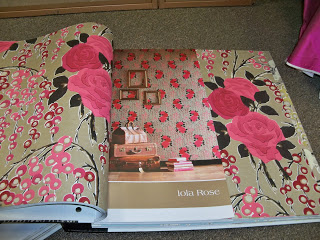
The Iola Rose wallcovering is from Harlequin. I love the black and tan paired with the glorious pinks. The more subtle tan and black keep the pink from overwhelming a space. It’s all about color and balance.
This Victorian home has a stunning color palette. The use of black to outline the green and red of the windows and door gives the house a tailored, refined look.
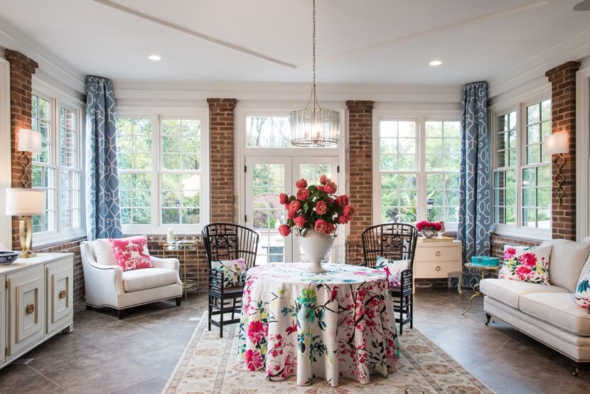
The pillow fabric, designed by Nina Campbell, has great color and balance. The textures of the fabric adds more interest to the setting.
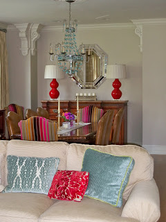
When I started designing this living room and dining room my client wanted to keep the palette neutral. Over time she discovered she wanted more color. So the palette was expanded. Red, blue, green, turquoise and even purple were added as accent colors. The neutral walls, window treatments, sofa and wood floors keep the colors from taking over the rooms.
This series of water colors by Muriel Eulich has repeated colors that are used in each individual painting. The paintings work as a group or on their own. The palette for your interiors should flow through each space but not every color has to be repeated in each room.


